The input

What Recto started with.

This is the kind of material the system starts from: useful thoughts, preferences and positioning ideas that still need judgement and structure.

Business idea

Recto turns rough business ideas into clear brand and marketing direction. Free Snapshot gives the direction, Look Real builds the identity, Brand System builds the full system, and Expert Support covers custom marketing work.

Audience

Early founders, side-project builders, freelancers, creators and small businesses that want strong branding without a large agency engagement.

What is already in mind

Editorial, sharp and document-like. Dark green, warm paper, black, thin borders, serif headlines and clean sans-serif body text.

Positioning thought

Combine positioning, naming, identity, customer thinking and practical marketing direction at a much lower cost than a typical agency engagement.

Name

Recto. It means the front side of a printed page and fits the idea of turning something rough into something structured and usable.

Brand feel

Straightforward and no-nonsense. More serious than playful, more simple than expressive, practical, and slightly bold.

Before and after

The value is the decision, not the extra copy.

Recto takes broad founder thoughts and turns them into choices that can actually guide the brand.

“We do positioning, naming, identity and marketing direction for much less than an agency.”

Recto decision

Own the early judgement moment. Recto should be the editorial direction layer for businesses that need sharper decisions before they need a full agency.

“Editorial, dark green, warm paper, black, serif headings.”

Recto decision

Turn the page metaphor into a repeatable identity: Warm Paper, Press Ink, Editor Green, editorial type, and one front-page move that carries through the logo and layouts.

“Free gives direction, Look Real builds identity, Brand System builds the system.”

Recto decision

Make the product progression itself prove the brand: diagnose first, choose the identity second, then turn the chosen identity into repeatable rules across touchpoints.

Free Snapshot · €0

First: decide what the brand should become.

Free Snapshot output

Rough ideas, made readable

€0

Core direction

Recto’s strongest direction is an editorial brand engine for people who have a business idea but need sharper decisions. It should feel like a strategist and editor looked at the mess and turned it into a usable page.

Brand archetype

Sage. Earn trust by making things clearer. The brand should look editorial, speak plainly, show its reasoning, and make better calls than the customer could make alone.

Name note

Keep Recto, but give it a clearer descriptor in early use. The name has strong editorial meaning; the surrounding system should explain brand and marketing direction quickly.

Visual hint

A quiet editorial type system, warm paper, deep green and black type, with one page-side logo move repeated through emails, product cards, posts, checkout and exported documents.

Look Real · €9.99

Then: turn the direction into an identity you can choose and use.

Look Real output

Rough ideas, set into shape

€9.99 · early access

Signature idea

The Front Page Move. Rough thinking becomes a clear front page. The visual system should make that shift visible instead of decorating around it.

First impression

Calm, sharp, serious and practical. The brand should feel like an editorial proof that turns uncertainty into a usable call.

Instagram bio

Brand direction for rough business ideas. Snapshots, starter identities and usable marketing calls. Rough ideas, made readable.

Tone starter

Sound like a sharp editor: diagnose the mess, make the decision, explain the reason, then give the next usable move. Calm, direct and commercially aware.

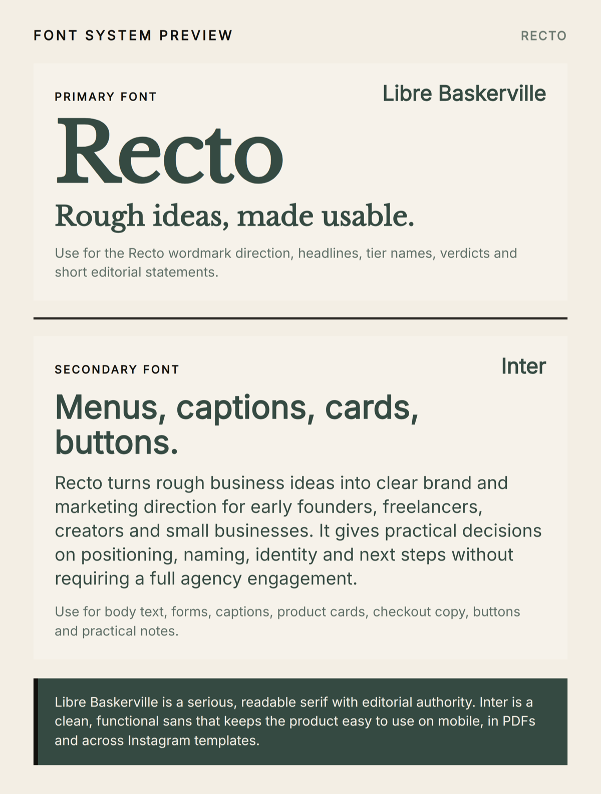
Font system

Newsreader for editorial headlines and the brand voice. Inter for forms, body copy, labels and practical product UI.

Next actions

Set up Instagram, build one reusable Decision / Reason / Next move post template, and create a simple launch page that shows rough thinking becoming a clear brand direction.

Three logo routes, and your choice

01

Refined

Clean wordmark

The Refined logo route generated for Recto

Concept. A sharp serif Recto wordmark where the R carries the identity. Its vertical stem becomes a strong page margin while the remaining letters stay controlled and readable.

Why it works. The most immediately usable route. It keeps Recto serious and editorial while making the page metaphor visible without adding a separate icon.

02

Distinct

Symbol and wordmark

The Distinct logo route generated for Recto

Concept. A compact page symbol sits beside a simple Recto wordmark. Loose text blocks align into one clean front-page area, anchored by an Editor Green decision edge.

Why it works. It gives Recto a stronger standalone asset for social icons and product labels while expressing the service clearly: scattered input becomes structured output.

03

Bold

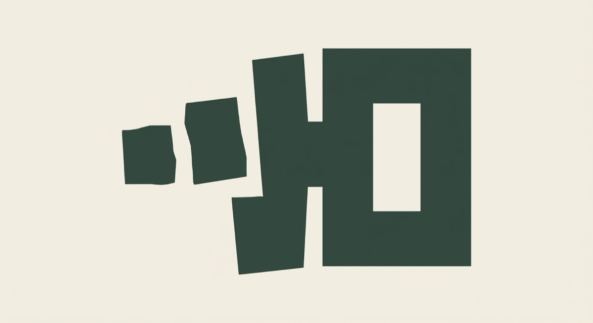
Standalone symbol

The Bold logo route generated for Recto

Concept. Three uneven forms resolve into one clean rectangular front surface through negative space, like disorder being edited into a visible page.

Why it works. The most ownable route. It can work as a profile icon, favicon, sticker or badge without relying on the full Recto wordmark.

Colour system

Warm Paper
#F3EEE4 · primary

Press Ink
#11100D · secondary

Editor Green
#354A42 · accent

The rendered font system Recto generated for itself
The rendered font system, as delivered.

Brand System · €49.99

Finally: make the chosen identity behave consistently.

Brand System output

From identity to operating rules

€49.99 · early access

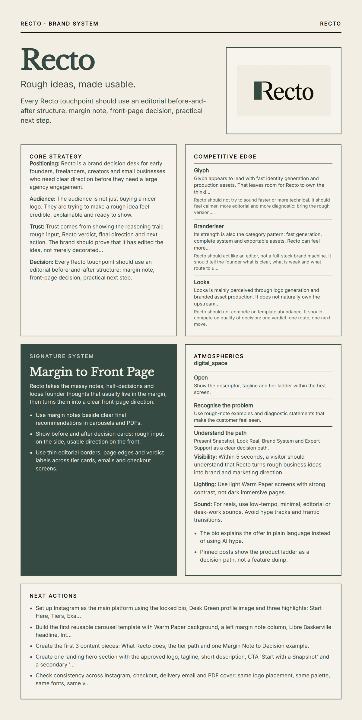
Core strategy

Clarity before identity. Recto should own the moment before agencies, templates or asset generators make sense: read the messy business thinking, decide what matters, then make the next move usable.

Competitive contrast

Do not win by promising more assets faster. Recto should make the judgement visible. Strategy, naming calls, offer clarity and next moves become the proof.

Signature system

Turn the front-page idea into a rule across every touchpoint. Use a visible edge between rough input and decided output: uncertainty on one side, a clear decision, reason and next move on the other.

Customer journey

Open, recognise, choose, receive, return. Show one clear offer first, reflect the confusion through before-and-after proof, make the tier choice simple, deliver like an editorial proof, then end with practical next actions.

Touchpoint behaviour

Same decision logic, different surfaces. Instagram, landing pages, emails, checkout and product cards use the same hierarchy, the same chosen logo, the same three colours and the same decision-first tone.

The rendered Brand System board Recto generated for itself
The rendered Brand System board.
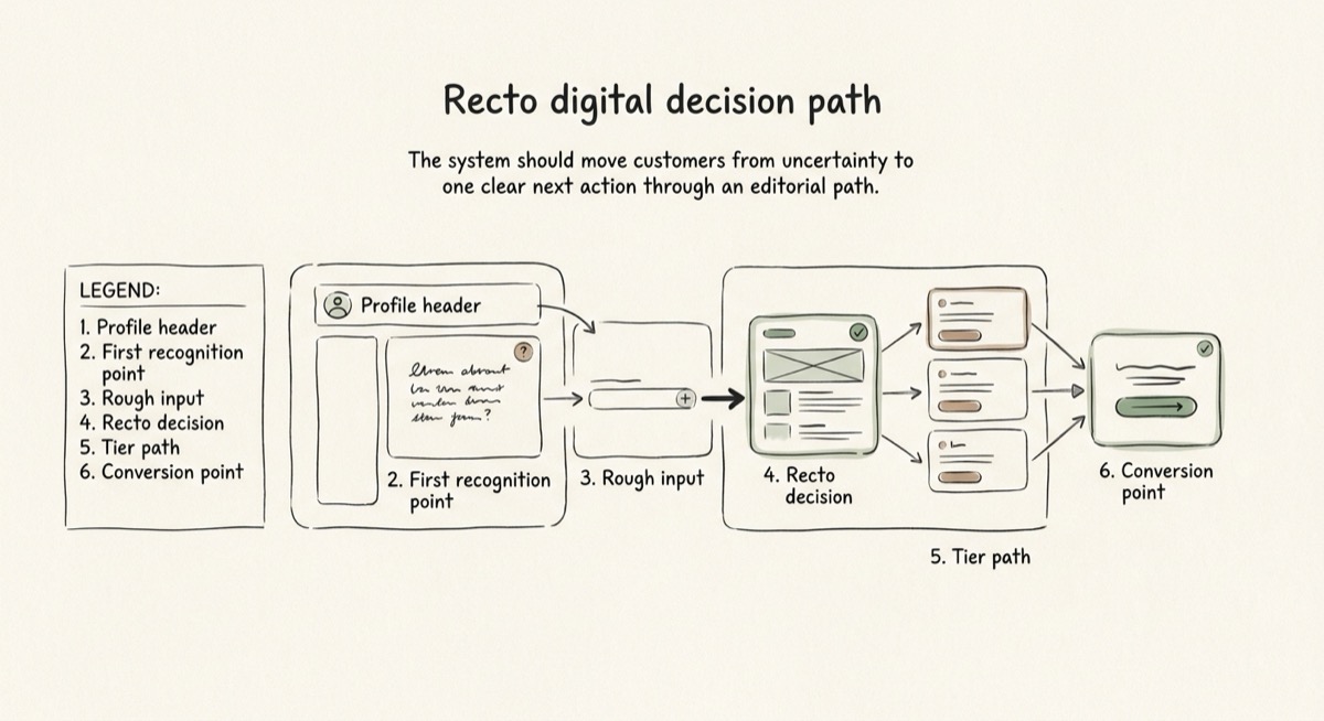
A sketch of the Recto digital decision path
The layout logic sketch.

What the example proves

Each level has a different job.

Free decides the direction

It gives a useful strategic read before the customer spends money on finished assets.

Look Real makes it tangible

It creates the name treatment, tagline, three logo routes, colour system, fonts, bio, tone and first actions.

The customer chooses the logo

The brand does not silently commit to whichever logo rendered first. The selected route becomes the locked foundation.

Brand System expands it

It adds competitive thinking, strategy and repeatable behaviour without replacing the approved Look Real foundation.